A Family Home Renovation
When we first met this client, she was a store shopper who said, “I’d love to hire you guys to come style my space but first, can we remodel my kitchen? I know it needs it, but I don’t know HOW to fix it!” Haha! She also had a CLOSET of cool things she’d purchased over the years that needed a designated spot! After seeing the space, we set some visual goals. Our objective was to make it look much cooler, more industrial, collected, eclectic, and original! They wanted space to cook as a family, plenty of room for pour-over coffees, room for craft beers, and display shelves for dishes and other trinkets. This family was in desperate need of a home renovation that would better serve their needs!
The Family’s Needs
There were two main areas we were focusing on: the kitchen and the upstairs playroom. These clients had a pretty small kitchen with hardly any storage! Only one person could be in the kitchen at a time to avoid traffic jams and accidents. They also had a breakfast nook that was separated from the kitchen by a peninsula, but it wasn’t even big enough to allow the kids to sit and do homework. It also wasn’t a good location for meal prep because it was so far away from the work zone. Additionally, the pantry didn’t store everything the family needed and the materials were a little dated.
The playroom was just the landing at the top of the stairs. It was only 10’x10’ and that’s not enough space to let the kids SPREAD OUT and play! Toys would travel to where they could be played with and they never returned to their playroom home, causing so much family frustration. Parents don’t need more stress in their lives, they need less. This home renovation would fix both the kitchen and the playroom!
Incorporating Practical Design
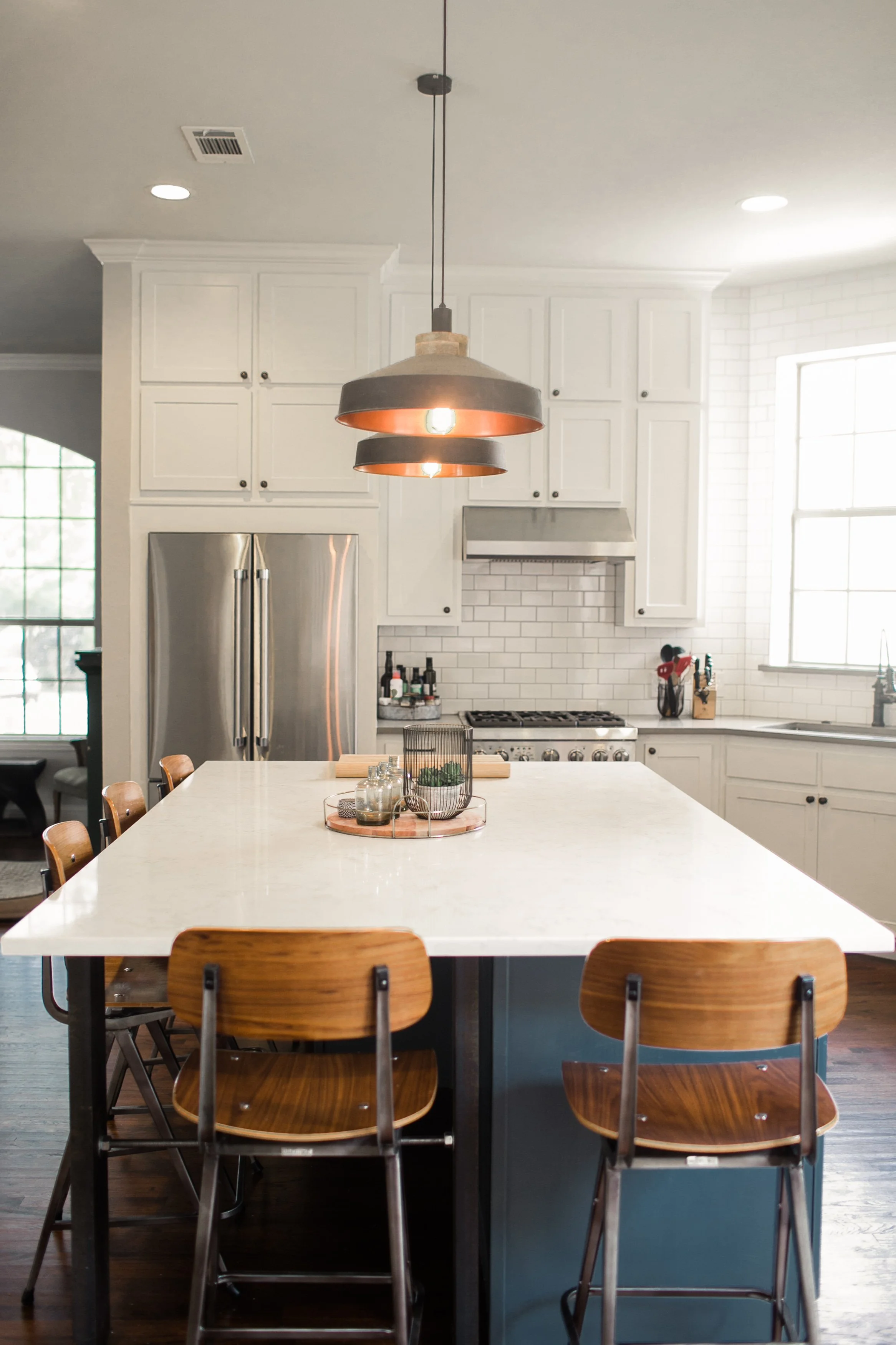
For the playroom, we lowered the 2-story ceiling of the family’s main living room. This allowed us to create a giant space upstairs where the kids could play. Now they can take the tent out on an indoor imaginary camping trip, and still have even more room to spread out! For the kitchen, we demoed everything and created a whole new layout. We moved the pantry, eliminated the peninsula, and replaced it with a large island designed with family dinners in mind. Instead of cramming a breakfast table into the small preexisting breakfast nook, we made the island into a space that would host all of their family meals. We replaced the old breakfast nook with a mini library and seating area, making it a great spot for the parents to relax downstairs while keeping an eye, or an ear, on the playroom activities upstairs!
The Interior Design Process
The playroom was easy. We just extended the existing 2nd floor landing to cover more of the family’s main living room and designed toy storage! A few cute pieces we utilized for storage included Crate and Kid’s 6-cubby shelves, old lockers, and more. One of the vintage storage pieces we incorporated is from an old hardware store. It was once used to keep bolts and screws sorted, now it holds all of the little toys that need sorting like matchbox cars!
In the kitchen, we knew we wanted the island to look less like custom cabinetry and more like a cool, vintage, found furniture piece. We made the selections for the island intentionally different than the selections for the perimeter, or edges, of the kitchen. The island cabinetry is a different style (round-edged flat-front vs shaker), the countertops are different (marble-looking quartz vs concrete-looking quartz), and even the cabinet hardware is different than the perimeter cabinets! The pendant lights, counter stools, and the island’s industrial support legs came from vendors on Etsy! Getting unique things from small makers helped us to stay on track with our original vision for this kitchen renovation.
A Surprise Along the Way!
Mid-way through the kitchen and playroom expansion, the clients found out they were expecting a baby! That helped cement the decision to expand the playroom because there would now be a third child ready to play! After finding out about the baby, the client pulled a beautiful mobile out of the closet that was just waiting for its time to shine! It became the inspiration point for the baby girl's nursery. This was certainly the most memorable part of this home renovation!
My Favorite Part of the Process
My favorite part of this home renovation was the care we put into making sure their home looked unique and collected. We’ve all seen a few Pinterest photos where you can’t tell if it’s one brand’s catalog photo, or just someone who bought everything from that brand! Here, we intentionally curated repurposed and new items from multiple different sources to ensure the client’s industrial taste was spotlighted.
At Lambert Home, we love the use of such intentional styling to make the space look authentic for each client! Have you had a hard time finding a designer who wants to understand your unique blend of tastes? Set up a consultation with us! We’d love to help create spaces you love!


