Farmhouse Kitchen Before & After - Southlake, TX
Here's What We Did
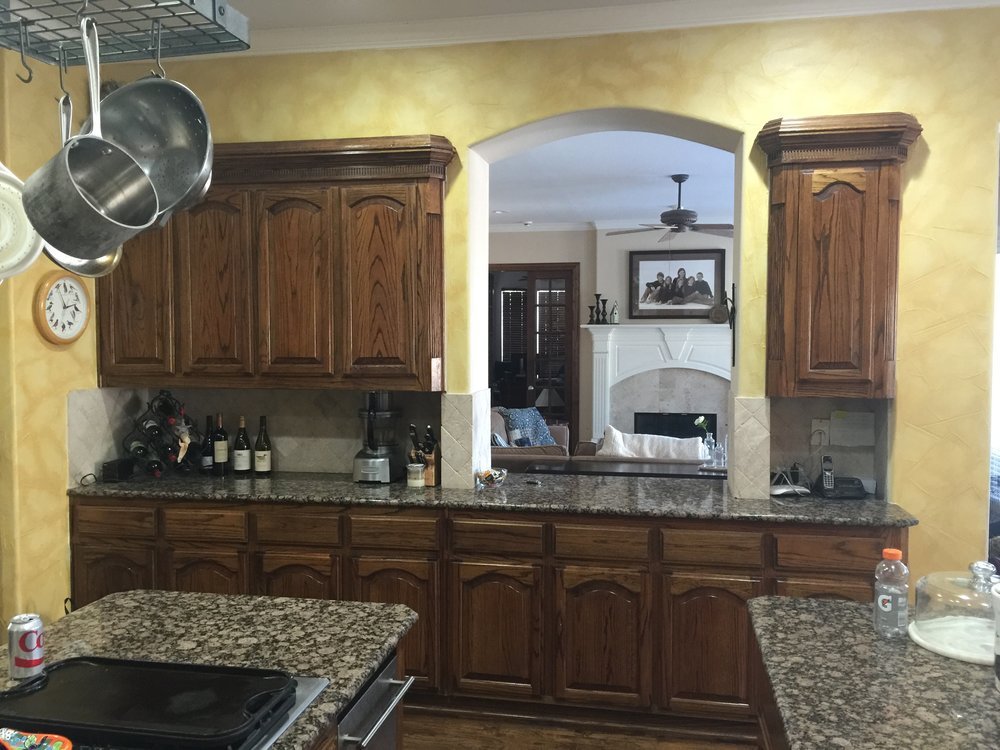
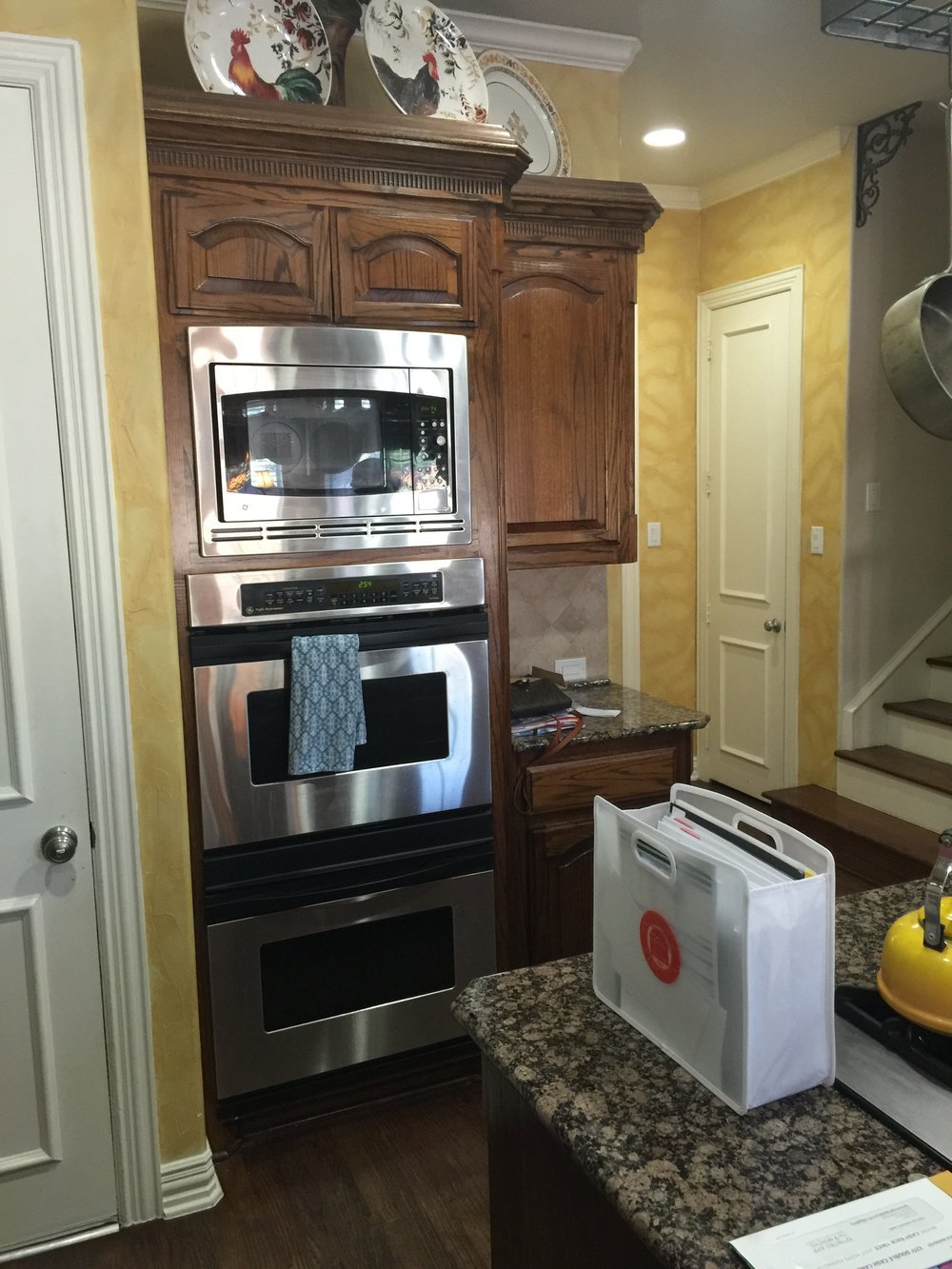
As designers here in Texas, we get a lot of "Have you seen that show Fixer Upper?" We have! Literally 50% of our initial client meetings bring up the show. So we've figured out how to ask the right questions so that "I want Fixer Upper style" is translated into your real wants and needs! In this case, they wanted the kitchen to feel lighter, brighter, more current, and simplified. This family is in the day-to-day grind of raising teenagers and anything we can do to help simplify life and give them a deep-breath moment, we'll do!
Kitchen Upgrades
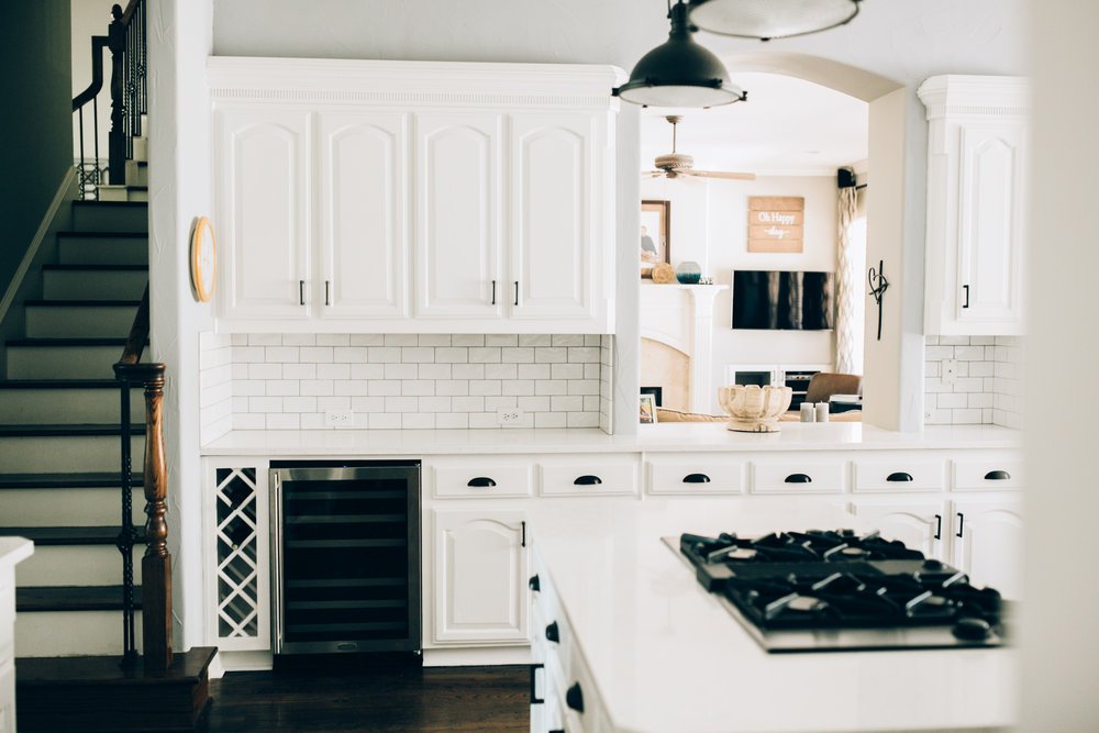
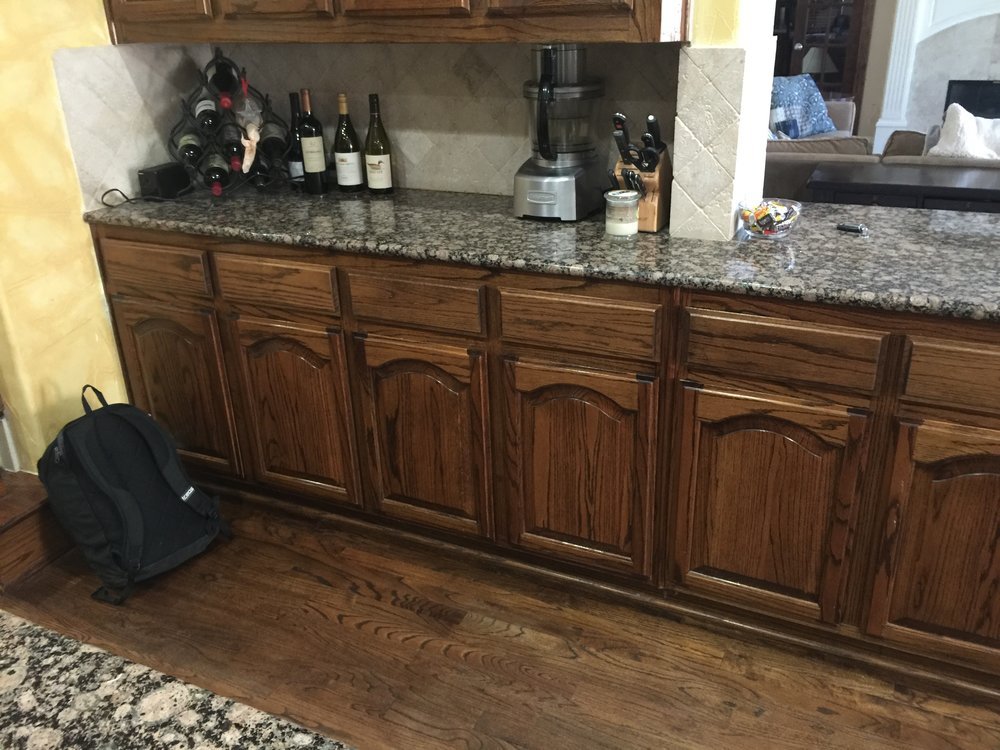
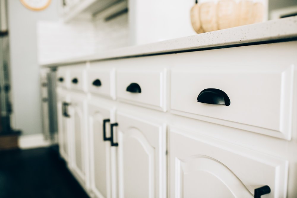
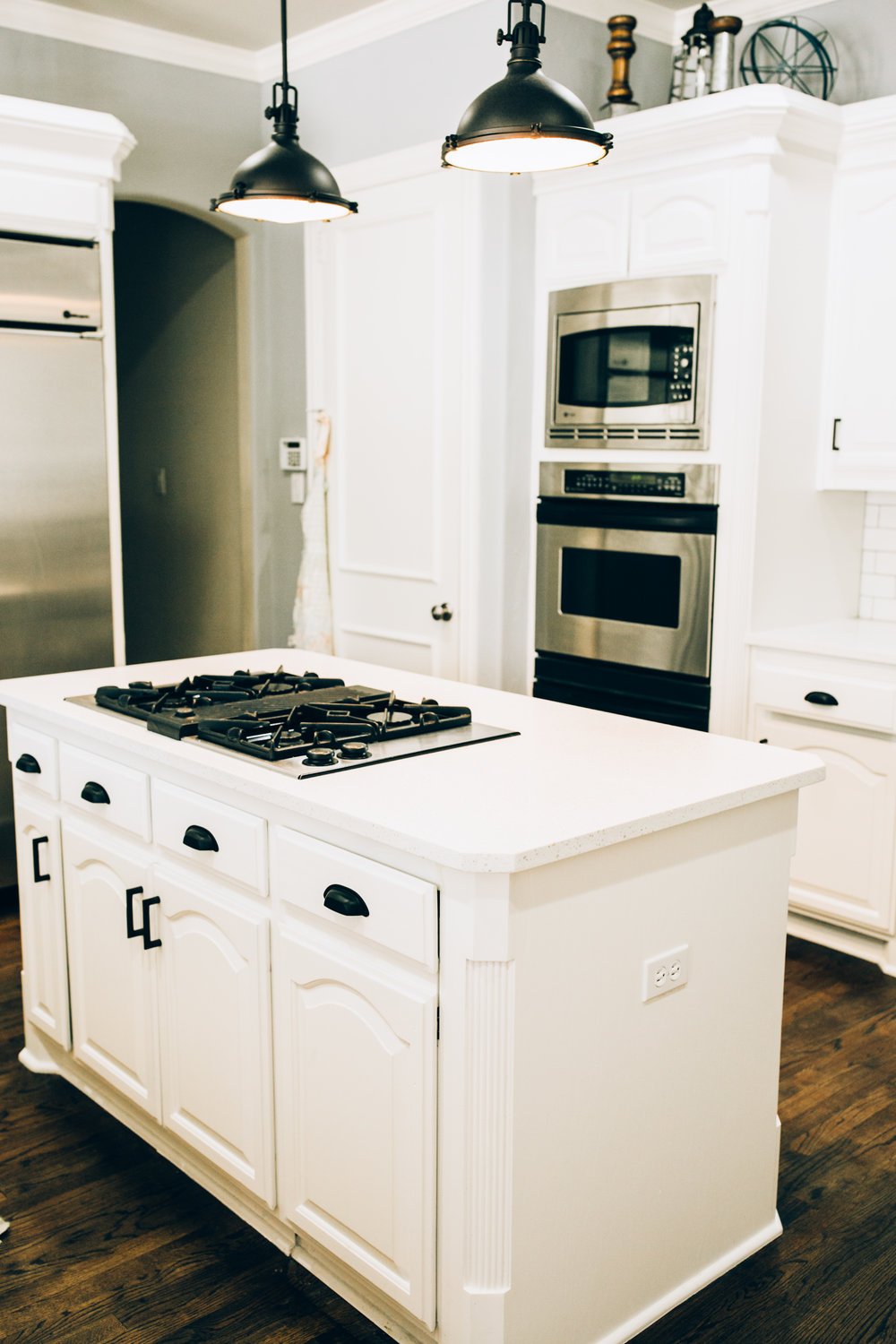
Step 1 was painting the cabinets. They were in great shape, but were just too dark. Once that decision was made, we could move on to step 2: countertops and backsplash. We believe hiring a designer should help simplify life. If you'e ever walked into a tile showroom, you know what we're talking about! "I thought I knew what I wanted but now I'm overwhelmed!" We gave this client choices--A or B. Both will be beautiful. Choosing finishes should not be stressful! Life has plenty of other things that cause stress, countertops should not be one of them. We chose a quartz that would work well with fast-paced teenagers, and a white subway tile that looked hand-made. Add in black light fixtures and black cabinet hardware for a little fun contrast and we're in business!
Wine Cooler
The final piece of the puzzle was fitting in a wine cooler in their current layout. We chose a little-used corner to install the cooler and ended up with 8 inches extra. We filled the extra space with a custom wine rack that will store a few bottles that don't need refrigeration. It added a custom touch to this kitchen remodel.
Small Upgrades, Big Impact
We're so proud of how this kitchen turned out because the difference is night and day! We didn't have to change the layout. We didn't have to change the appliances. With 2 weeks, some paint, tile, and beautiful hardware, the kitchen looks BRAND NEW. Thinking about doing a kitchen renovation can be intimidating but it doesn't have to be scary or life-ruining! We really love the lights we added over the island after removing the pot rack. It makes the ceiling seem taller and the room more spacious. Plus it adds a beautiful visual break from all of the white!
Products we used: Quartz. Backsplash Tile. Pendants. Faucet (and Soap Dispenser). Door Pulls. Drawer Pulls.
Paint colors selected: Sherwin Williams SW 7071 Gray Screen and SW 7004 Snowbound


